Here is an example of different genomics analyses performed on a sample (32 normal tissues and 32 gastric cancer tissues) extracted from a publically available database (The Cancer Genome Atlas – TCGA). The extracted patient data can be found here in .csv format.
Differential expression
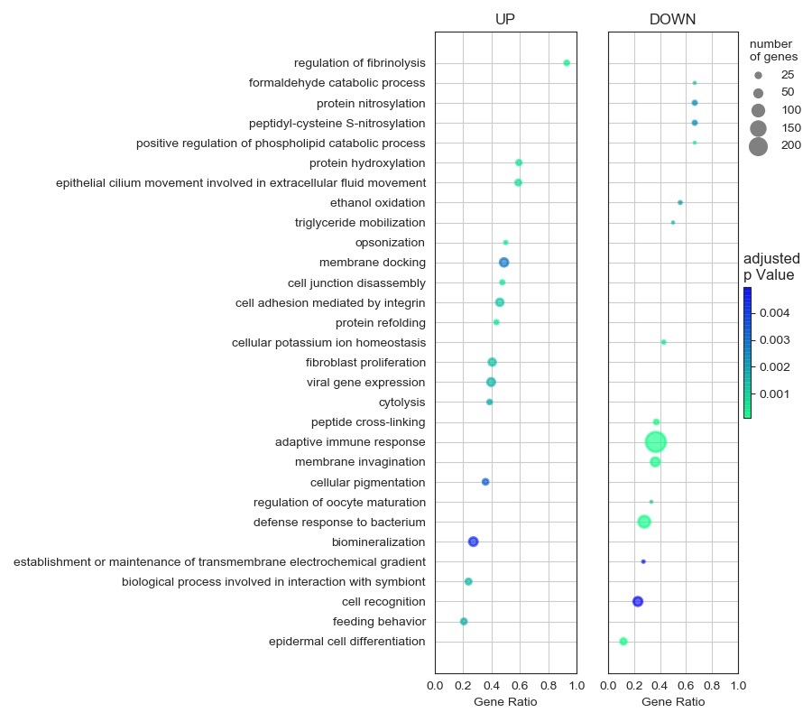
The FPKM data was statistically analysed to obtain the differential expression file. Next, clusterProfiler package in R Studio was used for gene onthology analysis, yeilding a row result containing a certain degree of redundancy. This result was further refined using REVIGO and the top 30 enriched functions were customly visualized using Python 3.
Volcano Plots
Target genes in the data set can be identified by volcano plot visualizations of individual genes as Fold Change (FC) vs. p-Value, using treshold values for both FC and pValue, and labels for the most significatively modified genes and for the most over-expressed or under-expressed genes. The graph shown below was plotted in Python 3 using matplotlib and adjustText libraries.

GSEA analysis
Gene sets involved in different processes are publically available and can be used to asses whether genes involved in a particular pathway or process of interest for the research are significantly modified in one group or another. Here we prezent the most significantly modified hallmark gene sets in the example dataset, using Gene Set Enrichment Analysis.

Get more insight of the genes involved in a process
Genes consistently increased or decresed in one group compared with the other can be easily identified, and their relation with other genes in the same set evaluated, by clusterplots or network analyses.

Dimensionality reduction
Multi-dimensional data can be reduced to fewer dimensions, while maintaining as much of the data points separation as possible using techniques such as Principal Component Analysis (PCA). For different characteristic populations, the data points should cluster together, offering means for the caracterization of new data points or for model construction (such as genes that are enough for discerning between tumor and normal tissues).

Cell type enrichment analysis
The relative abundance of different cell type in each sample can be assessed by various available programs. Here we show a clusterplot linking samples with similar cell enrichment profiles and cell types that tend to correlate, based on the results obtained with the cell enrichment assay algorithm from xCell.
